Our approach to design centered around the brand’s core value — purity. We set out to create a visual identity that not only reflects the clean, natural quality of the products, but also embodies the brand’s deeper commitment to self-care as a moment of pause and restoration.
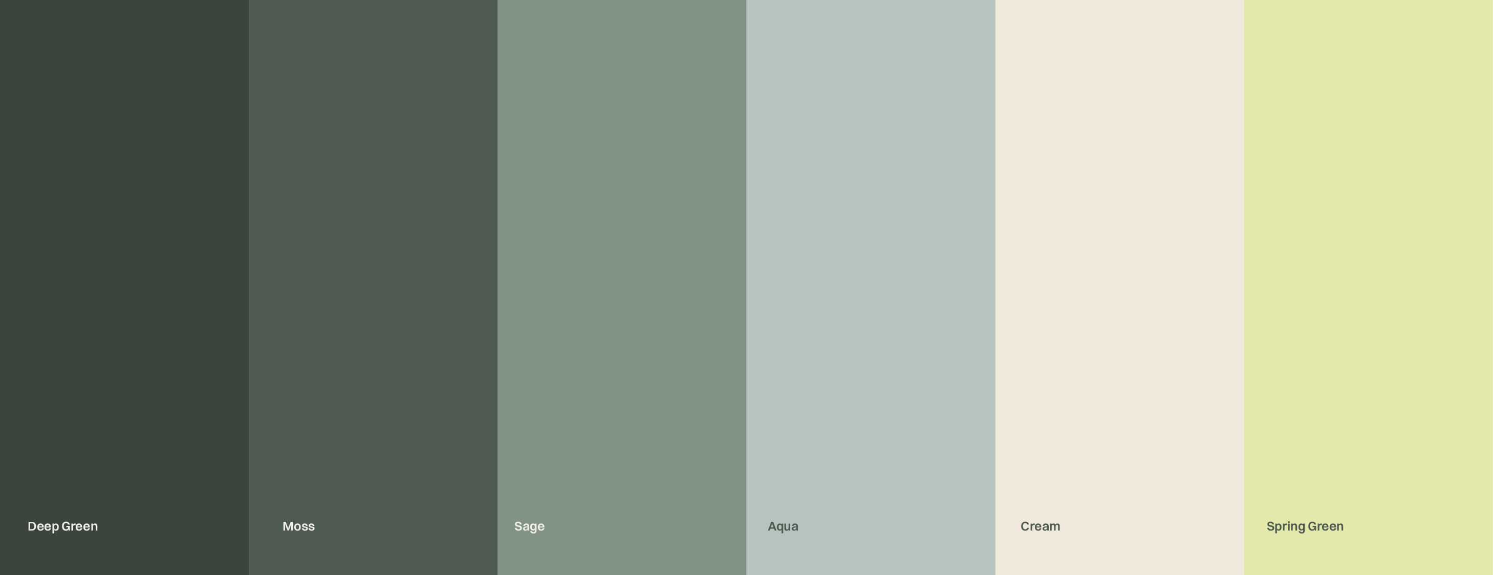
A calming, grounding palette of deep greens evokes tranquility and mindfulness, while a subtle accent of spring green brings in a sense of energy, vitality, and renewal.
At the heart of the identity is the PP monogram — a minimalist brand icon that combines clarity with subtle elegance. The use of clean, sans-serif typography enhances the overall simplicity. Through gentle shifts in weight and spacing, we brought in a sense of balance between sophistication and approachability.