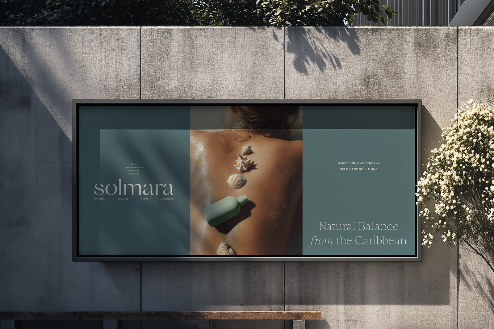
Solmara offers clean, sustainable body care products made with natural ingredients sourced from the Caribbean, where the brand originates. Created to support moments of care, Solmara’s mission is to bring a sense of natural balance to everyday routines through thoughtful, sensory self-care rituals.
The visual identity is minimal and modern, yet warm and approachable — echoing the simplicity and gentleness of the products. The logotype uses refined, friendly typography with soft curves, designed to feel both contemporary and inviting. The brand mark resembles a sunset over an island, represented in a minimalistic way, connecting back to the Caribbean landscape.
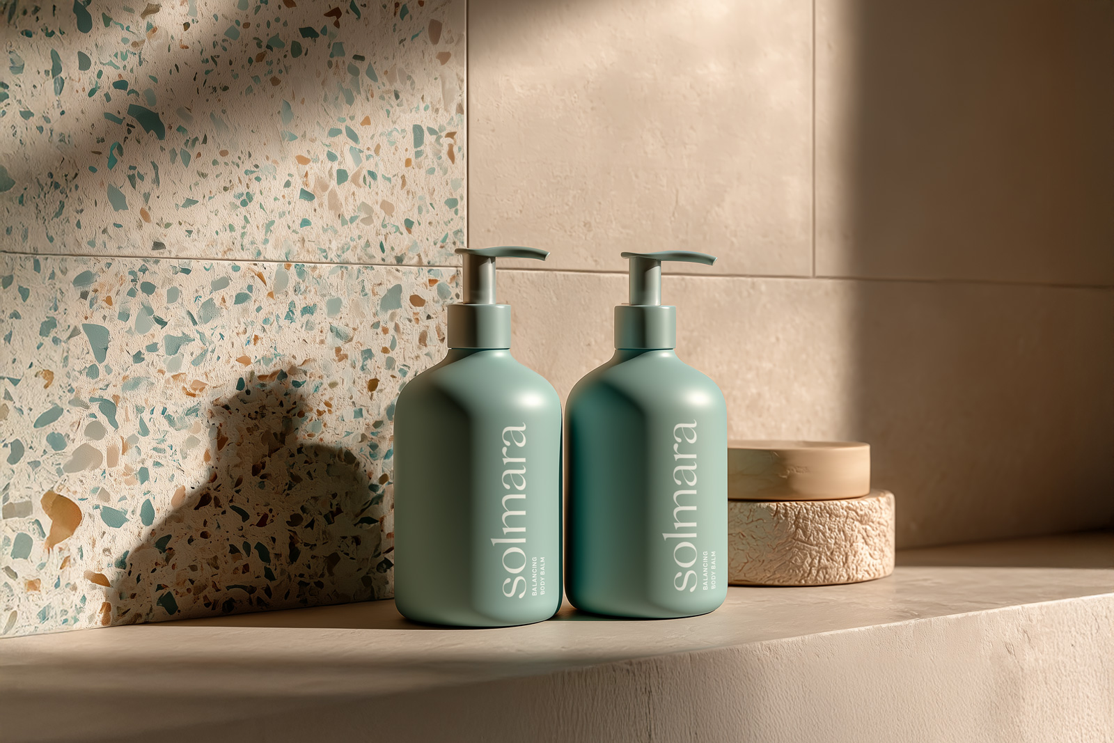
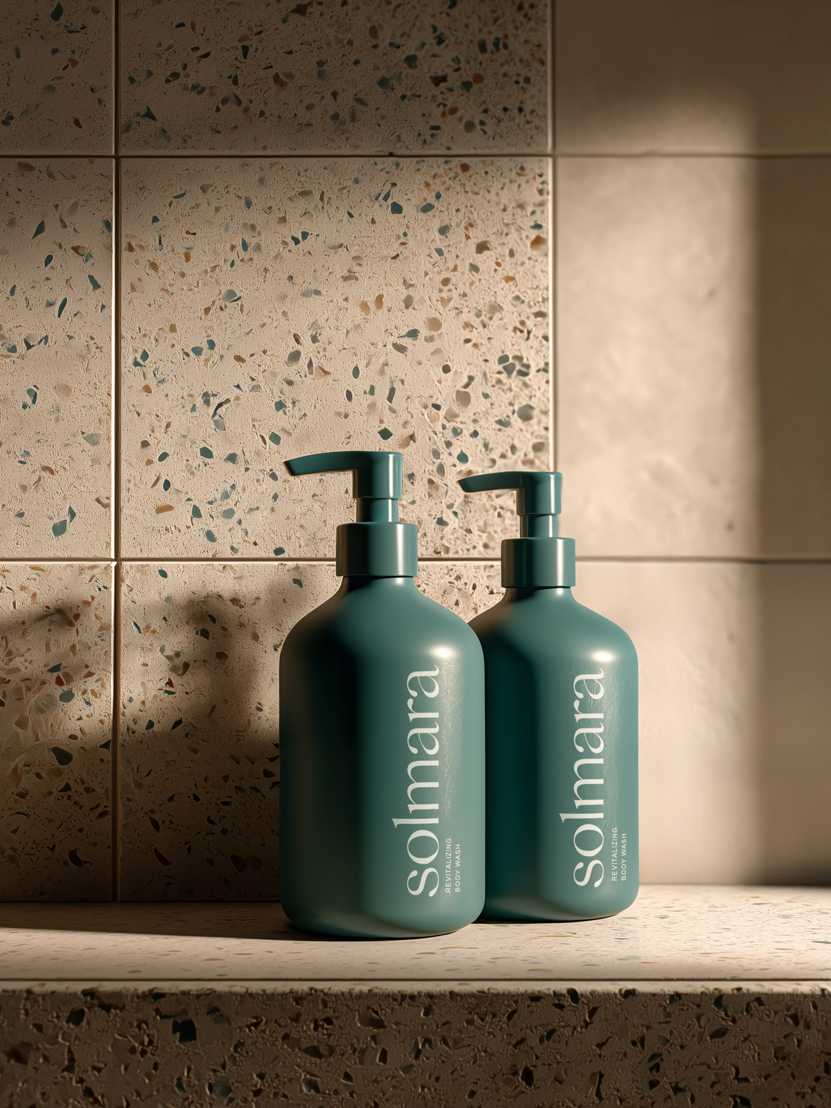
The brand palette is centered around gentle tones of aqua and teal, inspired by Caribbean waters, combined with warm, sandy neutrals. Together, they express freshness, softness, and a strong sense of place.
For the packaging, we chose soft-touch, mono-color bottles with rounded forms for a clean, tactile experience. The logo and product naming are applied in a minimal layout, keeping the overall look modern and unobtrusive — designed to feel at home in any bathroom.


