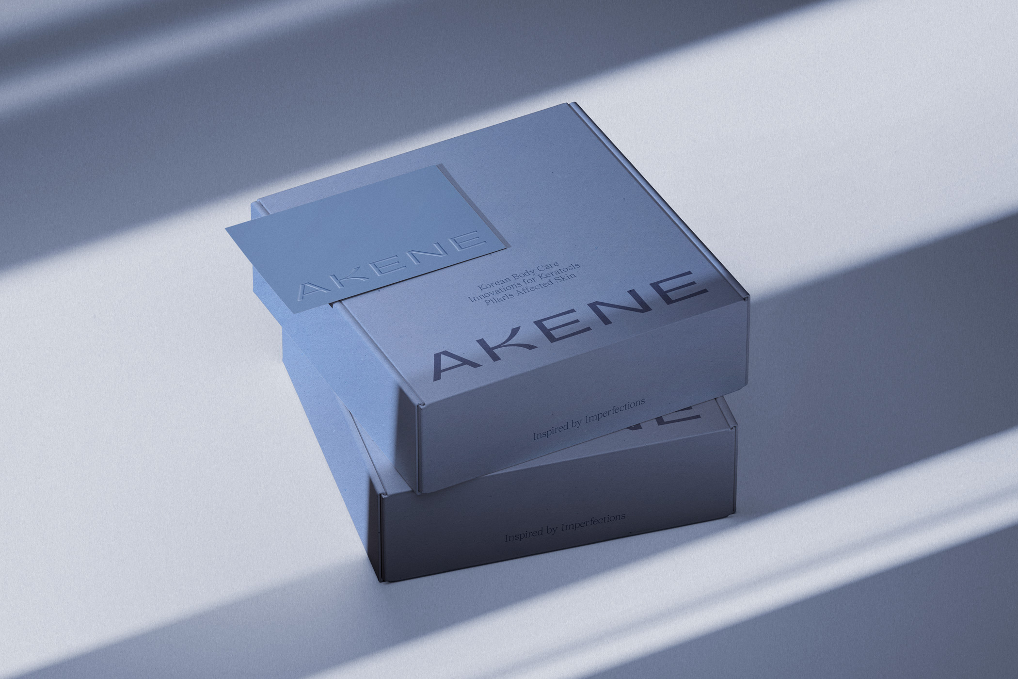
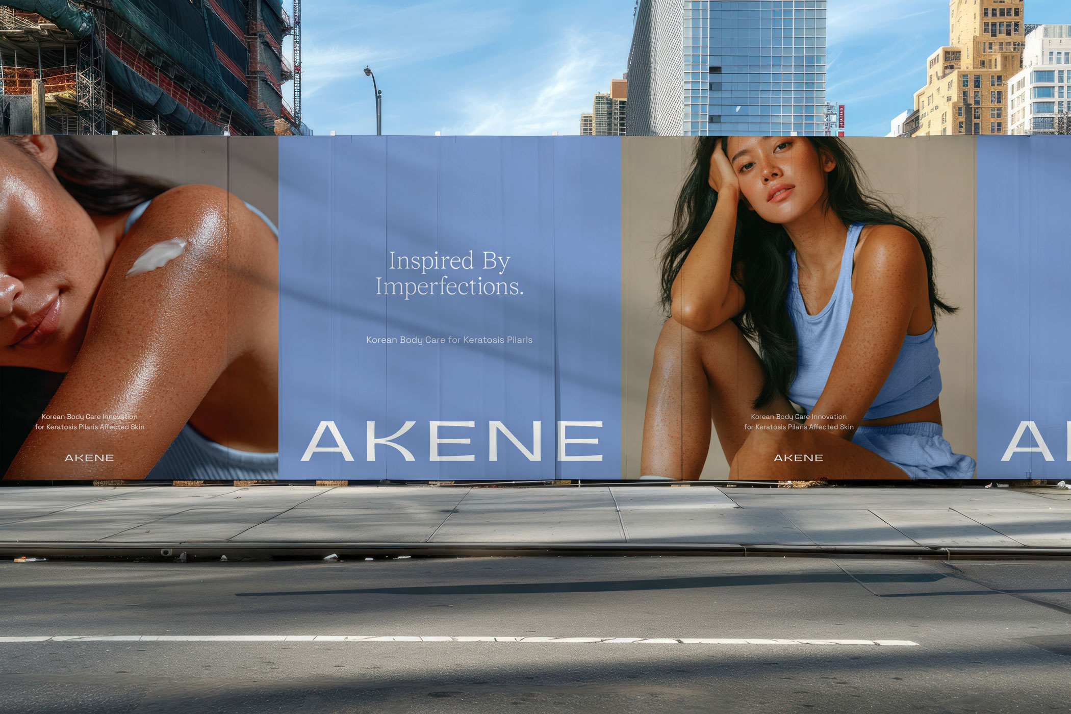
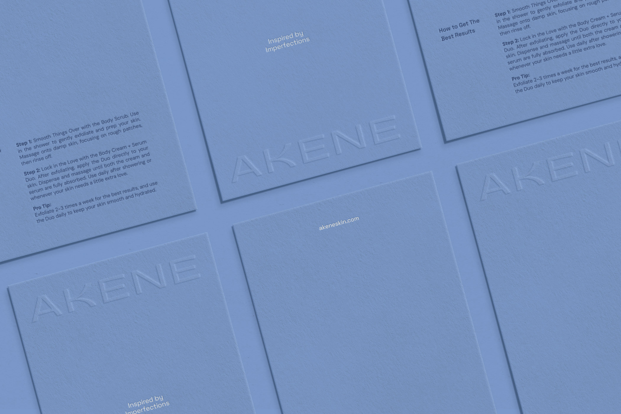
Akene is a beauty brand that bridges scientific credibility with the human side of skincare, addressing the stigma often associated with keratosis pilaris.
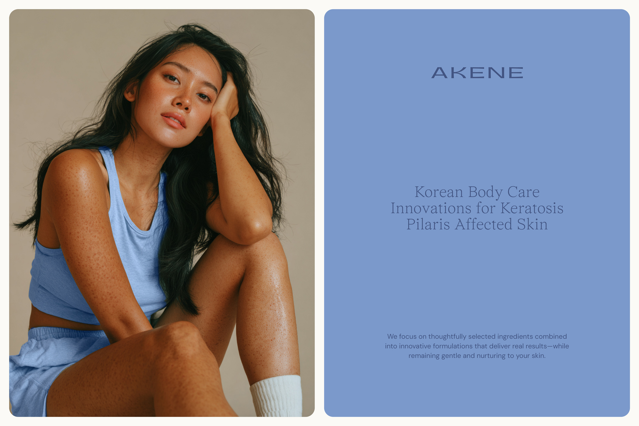
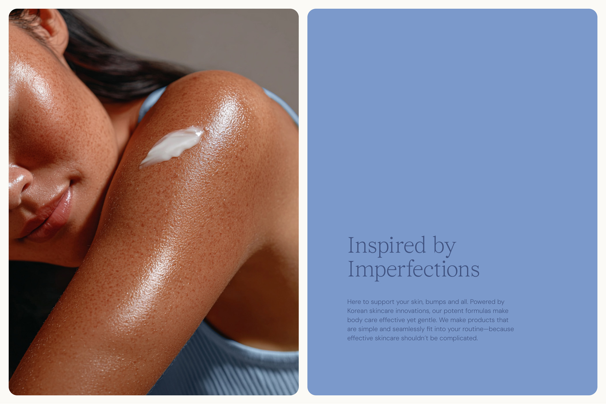
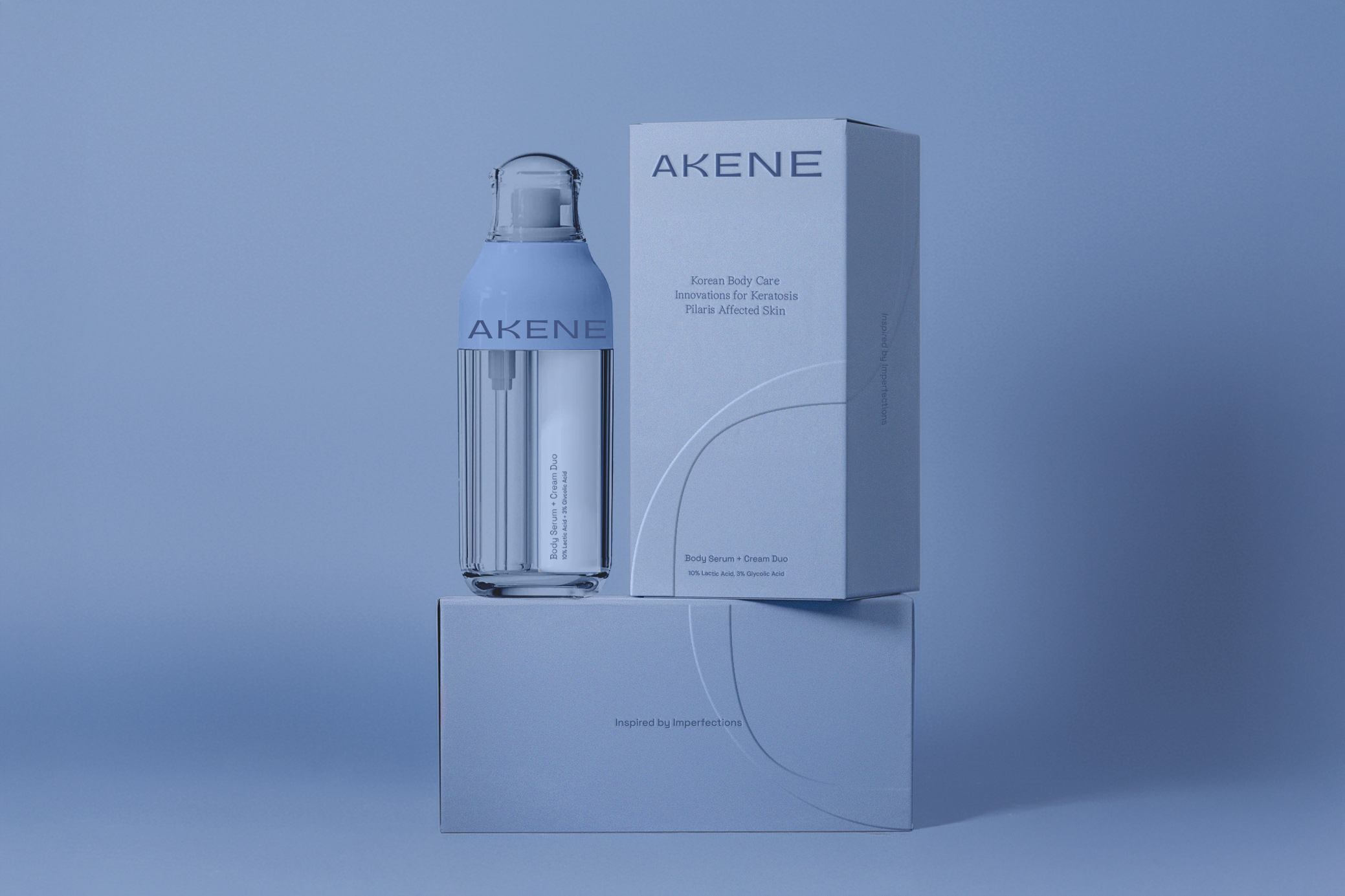
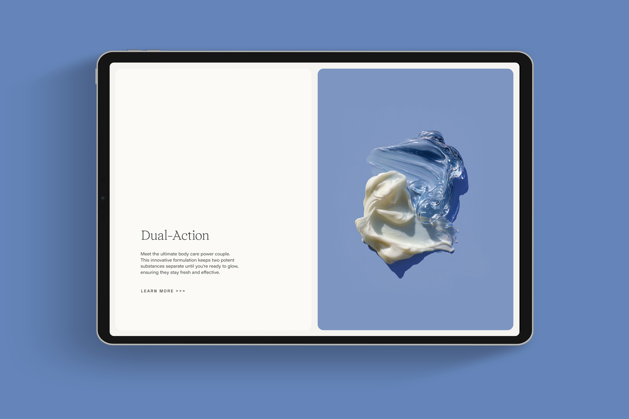
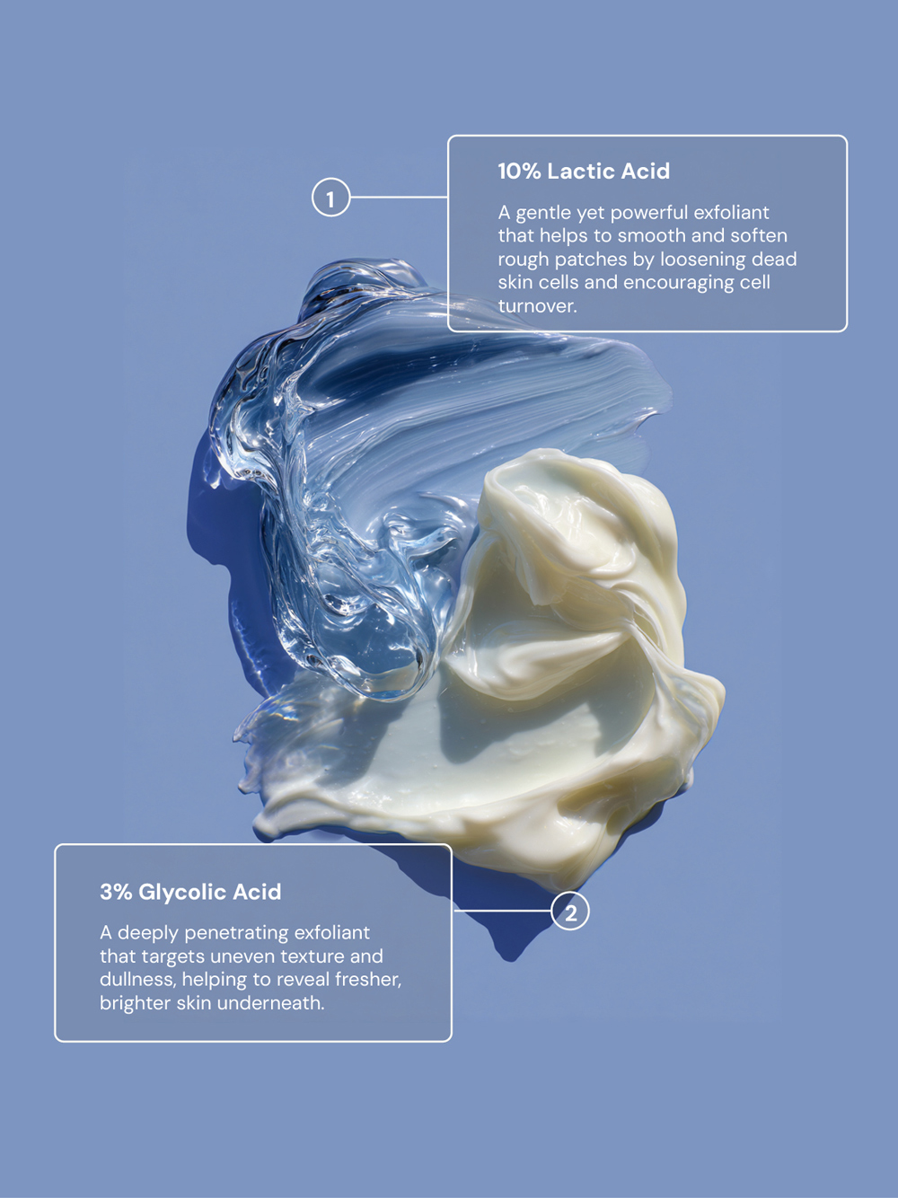
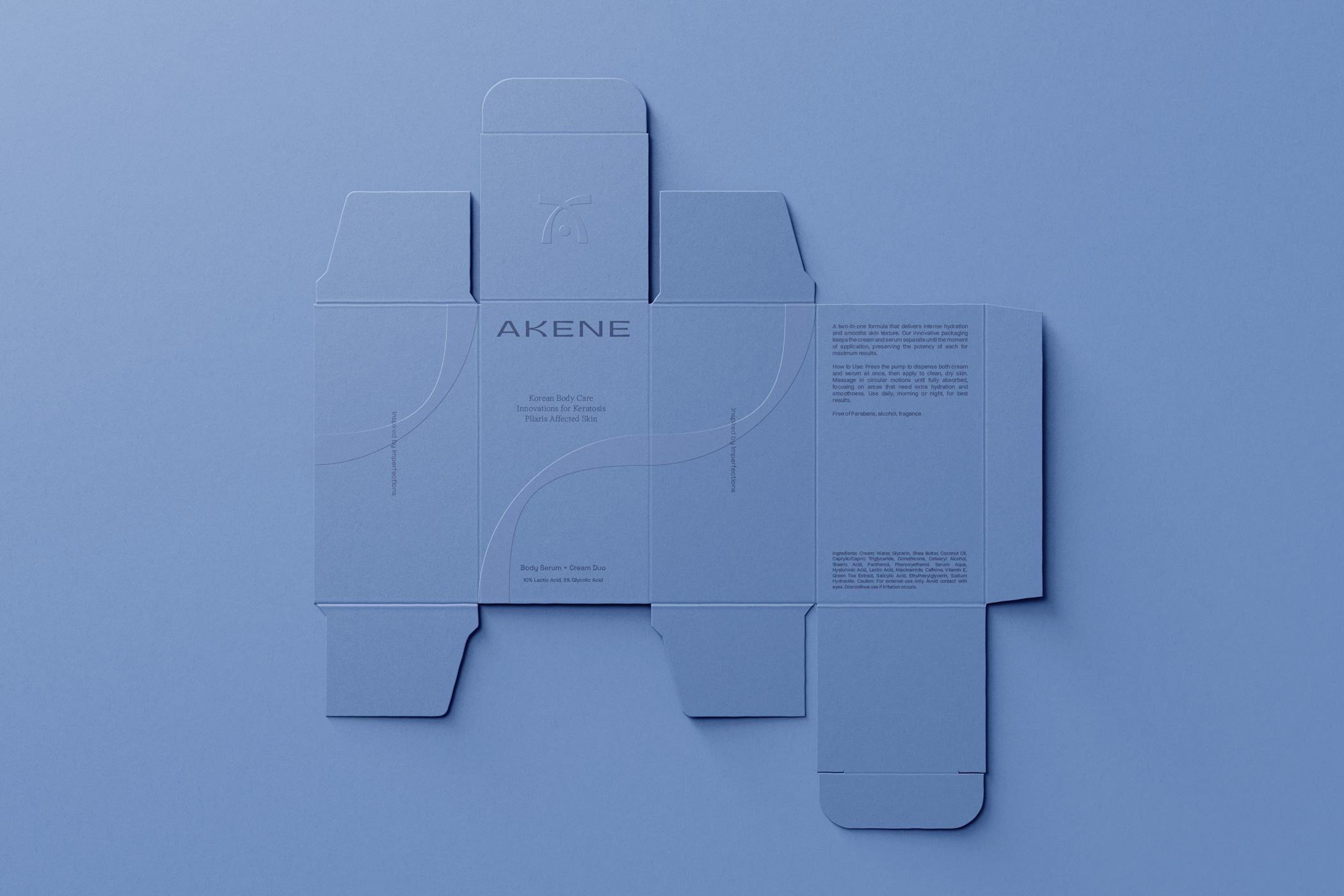
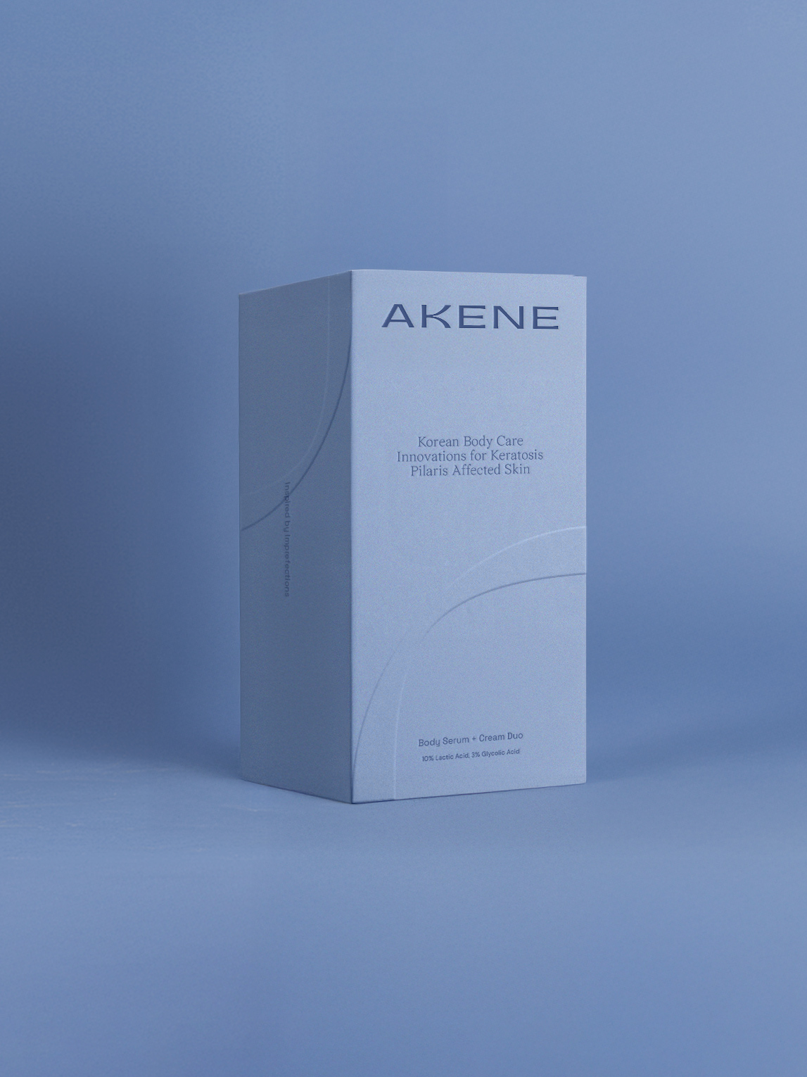
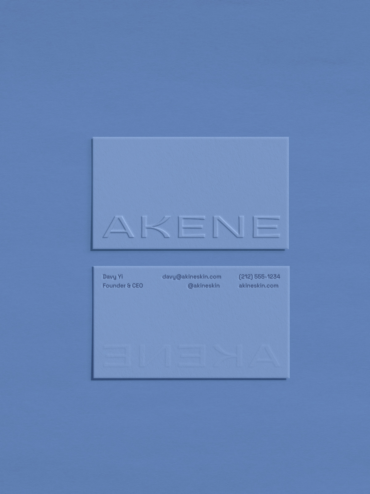
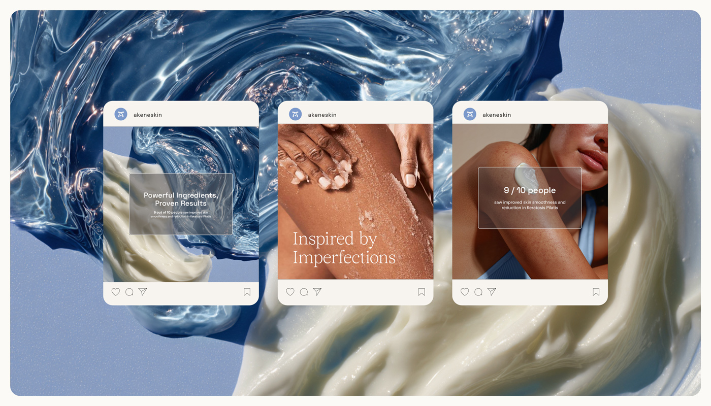
The visual identity balances the world of science — minimal, refined typography — with warmth and humanity through intimate, honest photography. The brand mark draws inspiration from Akene’s flagship product: a dual-chamber cream-and-serum formula that keeps two potent acids separate until application. Two flowing lines meet at a central “pump” point, symbolising innovation, balance, and transformation. A light blue palette was chosen for its calm yet impactful presence, giving the brand a distinct and recognisable visual voice across packaging, social media, and digital touchpoints.
